


Summary
I created Captain’s digital application from scratch, increased onboarding success by 30%, and designed a wallet feature where different types of users can exchange funds.
Background
What is Captain HQ?
Captain is a startup in the Fintech space providing capital to communities impacted by natural disasters. It ensures homeowners get their homes repaired fast by advancing money to contractors to pay for all fees associated with the repairs - all without homeowners having to work with insurers.
ROLE: UX Designer
PLATFORMS: Web & Mobile
TIMEFRAME: 2022 - 2023
Problem
How might we help users easily file a damage claim for a home that needs repair?
Since I was designing an application from scratch, I created a design system as the ultimate source of truth. My initial research encompassed users’ experience of Captain as a company through interviews. Once I created working prototypes, I conducted user research through usability testing.
Discover
Stakeholder Interview
CEO: We need to break down user actions into a consistent set of steps
Captain Admin Constraints: Unable to automate ALL actions because of certain user touchpoints
Marketing Constraints: Limited resources for conducting user testing - I implemented a research initiative, interviewing users myself for two hours/week
Engineering Constraints: Budget + time = complicated designs are a no-go
Key KPI’s:
Onboarding success
Calls/emails to Captain Admin decrease (clarity on what step the user is on in the process of filing a claim)
Time it takes for contractors to setup homeowner profiles decreases
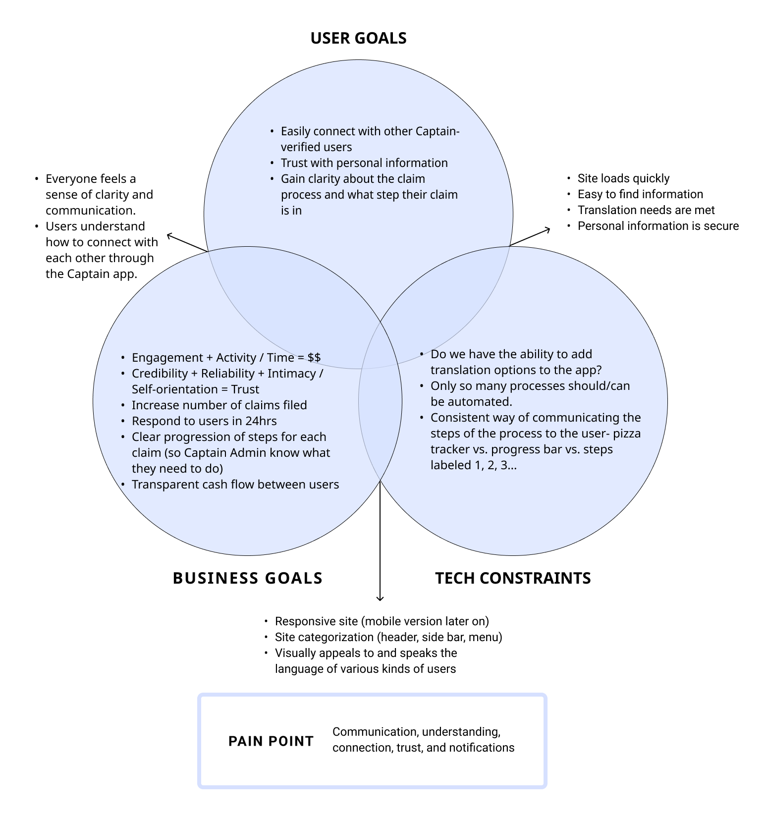
User & Business Goals
I needed to design 3 different flows for Captain Admin, Contractors, and Policyholders. To begin, I looked at other apps and took inspiration from their onboarding flows.


User interviews with contractors showed a need for:
A way to pay subcontractors
A dashboard with all current projects
Getting an advance payment on a claim

Homeowners were most affected by the stress of filing a claim and need:
Ways to build trust with Captain
Simple steps to hand-hold homeowners through the process

Understand
User interviews revealed the need to simplify the process of filing a claim and the value of building trust with homeowners.
90%
Contractors are male
75%
Homeowners are above age 50
100%
Homeowners would like to use a Captain Contractor over a random one
Defining the Problem
Out of the issues identified, 3 stood out as clear problems for users and the business:
Confusing User Experience: Who do users contact at Captain? How do they know what step they're on when filing a claim
Onboarding & Payment: Currently, contractors are asking homeowners for a wealth of personal information at a stressful time in their lives. Homeowners report that this is not an enjoyable process. Also, there is no transparency in the way checks are being written and received between Captain, insurance companies, contractors, and homeowners.
Budget and Time Constraints: Goal to release the MVP in 6 months, working within the current funding cycle.
Identifying Solutions
Ideating different discoveries
Develop Trust: Make the process of filing a claim transparent and clear.
Onboarding: Captain needs an onboarding process that captures all necessary information while mitigating gatekeeping.
Wallet Feature: To keep track of all payments coming and going between Captain Admin, insurance companies, contractors, and homeowners.
I delineated some fundamental product features we would need:
Onboarding
Uploading forms
A way for contractors to get paid
A way for homeowners to connect with a contractor

Building a design system from scratch
My team saw the value in design systems thinking, so I took some time to create a system that could serve the website and user portals.
Accessibility: I collaborated with Marketing on branding the website while aiming to create accessible portals for users. I used the colors and components from the design system throughout the entire application.


Creating sitemaps for each user type


Onboarding creation included building trust, being transparent, and removing gatekeeping


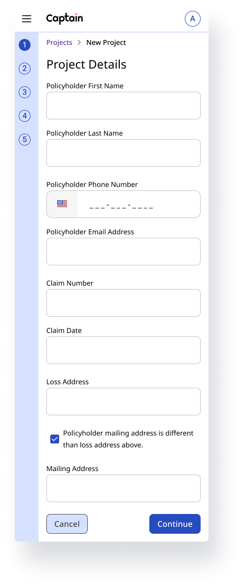
I added a way for users to contact Captain Admin, quotes to build trust, and a progress bar to show users how far they are in the process.
Initial proposed onboarding flow

Spoiler: My designs increased user onboarding by 30%.
Here’s part of the policyholder onboarding flow:

I created a place to visualize current projects across policyholders, contractors, and insurers with a filter for status.


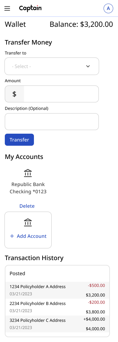
The Wallet

By this point, the need for a transparent flow of funds was obvious, but how and where would we add such a feature?
Considerations:
Captain needs to be able to pay Contractors.
Homeowners need to be able to upload claims and find Captain Contractors.
Contractors need to be able to pay Subcontractors.
Insurance Companies need to pay Captain.
How might we…?
Looking at a specific situation from someone’s point of view helps me get in the user’s mindset and figure out where to look for the solution first.

Solution
Admin Portal: Transfers
This section showed exactly how much money was coming in and out of the account (including the cash advance Captain was responsible for).
Contractor Portal: Linking bank accounts and transferring money
Constrained to a simple dashboard, limited time and resources, and a need to solve for all solutions, I kept it simple while following best UX practices as follows:
Impact
A web application that breaks down the process of filing a claim into simple steps
When we released the MVP:
20%
increase in user satisfaction scores
30%
increase in onboarding success
Accessibility
The app was fully accessible, meeting WCAG standards